Saturday, May 5, 2012

New Pillows


Ever since the new couches took up residence in my family room I have been looking to get some new pillows.  I ordered 2 yards of fabric from fabric guru which ended up being about $15, then I let it sit on my couch for a couple of weeks.  That fabric has finally made it's way to becoming my new pillows.  I have a thing for Navy and white this season!  It looks preppy and even a little nautical.  I just ordered an awning for my back yard in the same navy and white color scheme.
These pillows are 24".   I have tried many sizes over the years and I am convinced this size is not too big, not too small, in fact it is just right!


I'm in love with these little bowls from Anthropologie.  I stuck a bird's nest in this one and placed it under a cloche.


Sunday, April 29, 2012

Jill's Dining Room Reveal

I finally got over to Jill's house and got some pictures of her finished dinning room.  I didn't want to leave!  I love how her room turned out.  It looks young and hip just like Jill and Kevin are.  It is a great WoW room as you enter their house.  I hope you enjoy these before and after pictures as much as I do.
Before


After!

Jill has a great milk glass collection that she inherited from her husband's family.
The milk glass looked old fashioned in the brown hutch but it looks updated and impressive in her newly painted piece.  I want it!!

Dinning room chairs are a great place to add a throw pillow.  It can add pattern, color , and interest without changing the fabric on the chair.
I'm head over heals for the plates Jill picked up.  They add one more layer of color and texture.  The green wicker chargers could not be more perfect under the new china addition.

All the furniture got a fresh new look with a few coats of paint.  I covered the seats in black and white chevron, then repeated the black and white with the shades on the buffet lamps.  This room is completely transformed with no new furniture!  Just paint and a new light fixture.
What room are we doing next Jill??

Thursday, April 26, 2012

Welcoming Front Porch

We have a front porch that changes almost as often as the direction of the wind during a Nebraska spring. There are so many events and holidays that scream for something special to welcome guests as they approach my front door.  I have my front porch ready for spring.  This year I opted for spiral topiaries and pansies.  In the years past I have done ferns, boxwood, flowering vines...  the list goes on.  I like to have a little something from the inside make it's way to the porch.  This spring I have a small accent table with birds on the handles.  I placed a lantern with a candle that illuminates the porch at night.  I do a variation of this by placing a lamp with a flowering potted plant.
I stuck a urn with similar tones to the stone on the front of my house in my landscape.  The urn adds height to the color I adore to have in the front of my house.  I like to see some flowers from the street. This urn does the trick!

2 years ago my poor husband consolidated all the boxwood from our landscaping to our front walkway.  This year my now hedge is coming together nicely.  I like how the boxwood stays green all winter and defines the walkway to the front porch.

I love changing what is on my front door.  I have pansies welcoming my guests right now, but that will soon change to a summer arrangement.  

I clearly have a thing for topiaries!  These guys put up with a lot.  They get bows regularly, christmas lights, footballs, baseballs, basketballs, bird nests, kids who pick the needles to add to their latest mud stew.  Lets just say they take a beating and continue to shine.  We have landscape lights that shine on these beauties at night.

Friday, April 13, 2012

Dinning Room Chalk Board

Do you have a big wall that you just can't seem to find the right art for?  My dinning room had one of those walls just above the buffet.  I have tried several options but nothing spoke to me until I had the idea to paint the recessed nook with chalk board paint.  The best part is I'm a sucker for menu's and personalized messages during dinner parties or special celebrations.  This chalk board is giving me a place to  show my guests what awaits them when they come to my house for dinner.

I used my kids sidewalk chalk to put a huge frame in the middle of the wall.

This is the view from my entryway.  I really think my quart of paint made a big impact!
I'm hosting my first celebration this weekend since my chalkboard went up, and I can't wait to put it to use!  Happy Friday friends.  I hope you all had a great week.


Monday, April 9, 2012

Spring Break at IKEA


I have gone to a new low!  We took our first step into a IKEA this spring break.  My hubby is a living saint and he accepted the proposition of a family trip to IKEA, and mall of America for our spring break this year.  Stephanie spent hers on a beach in FL...  What is wrong with me???  So now that we are back in the swing of things I must show you what we literally hauled out of the IKEA.

I have struggled with furniture placement in my Family room since we moved in!  I had one couch and one chair in a big long room.  Needless to say I could never get it to look the way I wanted.  The answer was 2 EKTORP couches.  Tada!  I love it!  It finally works!


Here is the before...  I kept trying to angle the furniture in the room so I could make it look more full with the pieces I had.


Here is the after.  I love the balance that having 2 couches gives this space.  Even though I have more furniture the room looks bigger!


Monday is finally coming to a close!  I think I had too much Easter candy yesterday...  I'm feeling very sluggish today.  I'm going on a sugar fast starting tomorrow. (I Swear!)

Tuesday, April 3, 2012

Office Paint

Spring break has officially started!  Stephanie and I are off to enjoy some family time this week.  Before I go I wanted to share with you how my office is coming.  My office before was very dark!  I loved the color scheme but not the feeling of living in a dark hole.  So I kept the color but ditched the dark hole part.  Take a look...  What do you think?


Here is the before picture


Here is the After

The whole room got a fresh coat of white paint and then I stenciled the back wall navy blue for a accent wall.  The chair is from craigslist $10.  People ask me if I live on craigslist.  I really don't!  I swear!  If I find a need in my house I hop on and tool around until I find the cheapest thing I can that meets my needs.  The thing is I always try craigslist before going to a actual store.


This room is finally starting to feel like mine.  I have a few more things to do like drapes and some accessories but I'm getting there.

Wednesday, March 28, 2012

Jill's Dinning room color inspiration!

So I have just been reading my past blog posts and I'm mortified by all the typing errors!!!!  You would think I have been texting these posts.  I hope you can forgive me and love me anyway!
I'm in the middle of painting my office and my house is falling down around me.  The only person I let in is Stephanie as I have to because she is my running buddy and I know she won't judge.  That being said I can't show you any pictures of my messy house so I will show you some of my sisters dining room.  We are in the final stages of a great makeover.  The feeling we are shooting for is fresh, young, hip, and of coarse unique.  There is nothing worse than having a room that looks like everyone elses.  Check out a few progress pics.  I will give the grand finale when we get it put back together.

This is my color inspiration!!  My favorite coat.  Can you see the button falling off and how dirty it is?  That is true love!!

Step 1 we painted the top of the chair rail white and the bottom kelly green (coat color)

Step 2 we stenciled the bottom of the chair rail with the white color .

It is shaping up nicely!  I just want to stand and stare at it.  Does anyone else do that?
Last peek!  All the furniture in this room is getting painted and we are introducing some great new fabric!  You will pass out when you see the before and after pics.  Well you will at least see a big difference.  I hope to show you the final result this week!

Friday, March 23, 2012

Updated Fireplace!

Happy Friday Friends!  I have no idea where my time went this week?  I feel like I woke up Monday morning overwhelmed with the week to come, I blinked and it's now Friday!  I'm so excited to show you my finished fireplace today.  Before I show you let me just give you the background story.  So when we built this house my hubby gave me a very strict budget that I had to pick out everything with.  Needless to say by the time I got to my fireplace in the family room I had no more money.  I remember telling the tile shop just give me whatever I can get standard with the builder.  I have hated the way this fire place looked from the moment we moved in!  I begged my hubby to try a little do it yourself project that I had seen on HGTV a gazillion times.  (They make it look really easy!!!!)  Brad is much smarter than I and with passion he refused but he did give me the green light to have someone else do it.  Let me just say that after seeing what went into this tile instillation Mike my tile expert saved this house from some swear words and possibly a heated conversation or two!  So here it is finally...

Here is the before.  Brad had just tore off the huge dark brown tile.  Thats right it was basically brown on brown on brown.    Can you see the monster T.V. peaking out from the left side of the fire place?  ( Thats is going away too!)


This is our new friend Mike Sima!  If I could read his mind right now he is swearing up a storm.  He tore out that bottom row 4 times to get it perfect.  To my untrained eye I was thrilled with it but I let him get it just right.  I thought I had picked out the best tile for easy installation but it was not easy at all!  Mike had to cut all those tiny tiles and individually place them around the edges.  Sorry Mike!!!
I chose a hexagon marble tile.  I think it looks vintage with a updated twist.  When you walk by it almost sparkles.  Stephanie's 1st comment was "It is so shinny"  We also painted out the hearth and wall surround with the color Steamed Milk from Sherman Williams.

The bottom of the hearth is large marble tiles.  I love how clean this looks.  My mom thinks it looks "dressy" which is exactly what this room needed.  It is important to keep a balance if you have vintage finds in your decor like I do.  Before you know it your room will look like a flea market instead of a room with interest and character.

My monster T.V. has been replace with a smaller one and my handy hubby built those awesome floating shelves out of hollow core doors.  The only problem was the electricity and cable were down below where that basket is and I refused to have any cords so we had a electrician move the outlets for $60.  Totally worth that and so much more!!  Let this be a lesson...  Don't let a small bump in your plan (like the plug is in the wrong place) keep you from fulfilling your vision.

Thats it for this girl!  I'm counting down to an appropriate time for a glass of wine.
P.S. for local readers our Tile expert was wonderful to work with and his name again is Mike Sima 402-871-3678 if you need some tile assistance.


Tuesday, March 20, 2012

Before and after dresser


Do you remember my beloved dresser I had in my kitchen?  Well it is on the move and along the way it got a slight makeover.  

Here she is before her move

Here she is at her new home in the Hearth room.


A quick coat of white paint in the raised areas of the dresser transformed this little corner
 of my hearth room.


Hope you are having a great 1st day of Spring!!


We are in full bloom here!  The grass is green and our eyes are itchy and red.  Not that I'm complaining!

Monday, March 19, 2012

Oh for the love......

OMG I must share.....all the while I was furiously blogging my last post, this is what my 4 year old had pirated!  Mind you, I had checked on the status of my house more than a few times during that sitting and somehow he'd not only climbed onto the counter for the peeps, but somehow managed to get the jelly beans out of the apothecary jar without a single clanking of the glass.  How!?!?!  I was only alerted of the crime because of the telltale blue ring around his mouth.  He'd stuffed one peep in his mouth and stashed the other four plus the jelly beans in his fave hiding spot (behind the couch!) I only found his stash because, as I started the questioning, he immediately took refuge in his "spot", and inadvertently led me right to it. (much to my great pleasure, as dinner was only a few minutes away!)  Despite having his loot confiscated, I must say - nicely done, although eat faster next time, my boy. Ha!


Sunday, March 18, 2012

Entryway walls

This blog request is for Darci.  We all have those awkward little walls that present a design challenge in our homes.  Darci mentioned she was battling her entryway so I thought I would share a picture of mine since I just relocated a large mirror and I'm in love with the results.  I hope this offers a spark for you to address your own awkward space.

This large mirror made it feel like the small wall that I constantly worked at was eliminated!


I added drapes to frame out my front office.  I think it adds visual interest and of coarse you know how I love the layered look.

I bought this marble table for $30 at a thrift store.  Stephanie gave me that trophy for a birthday, I love it!  I wish I could find 10 more.  The crystal lamp is also vintage I just added the glass beaded shade which was on clearance this spring at pottery barn.

I finally can look out my window and see color!  That means we will be moving outside soon.  I'm in search of that perfect new umbrella and maybe some new pillows for the patio.  This week the tile guy is coming to update my family room fireplace.  I hope that does not disappoint you.  I love to try do it yourself projects but my hubby drew the line at tile.  I can't blame the guy!  Can't wait to show you the finished project.


Wednesday, March 7, 2012

Little girls room


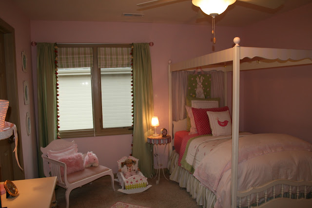
Brynn is my little 8 year old girlie girl.  She has started asking for a "big girl room"!  I have put her off for 1 more year but her cute little girl room is one of my favorites and I will never forget the time we spent together reading books or playing babies in this room.

I bought this bed on a antique outing with Stephanie.  Brynn was still in her crib but I could imagine her sleeping in this adorable bed.  I hung sheer drapes behind the bed which I think just adds another layer of texture.  I love the layered look on a bed.  I have pb kids mixed with target and they blend great!


I'm sure you will never guess where I picked this little bench up?  Thats right vintage thrift find.  $20 I thought for that price I could find a use for it.  I painted it pink and recovered the seat.

The inspiration for this accent wall came from a t-shirt I found online.  I love the simplicity of it.  (because that means I could copy it and paint it on the wall.)  Dresser was a freebee from Brad's Mom.


Here is a close up in case you want to try it out yourself.


We have adopted the slogan of the U.S. postal service.  "If it fits it ships"  Stuffed animals and babies have to fit in these 2 bins.  If a new addition would like to come in a old one needs to go to a little girl who has less than we do.  
These are just off the rack drapes that I added some trim to.  I bought the trim at Hancock.
Brynn's Bathroom


All the essentials are kept on a silver tray and I placed a small lamp on her counter in place of a night light.


Well I hope I have not blinded you with all the pink!!  I think I went a little crazy when I got to decorate a little girls room for the first time.  I wonder what the big girl room will look like???  The future bed is already sitting in my basement.  It is of coarse vintage and of coarse it was cheep cheep cheep so I could not pass it up.  Until next time...